Gnuplot is a really great plotting utility, that can be used either interactively or automatically, from inside scripts of all sorts. However, sometimes it can be quite difficult to use simply because there are lots of documentation, but it is hard to figure out exactly what piece of documentation you should read and where it is.
This is a big problem, because the way you plot data, that is which Gnuplot options you set, can make a huge difference in the readability of the plot. For example, I had this ASCII file called initial_data.dat, that lists the number of daily visitors to four different websites I follow (the complete file used for this article is downloadable from the link at the end of this page):
  20110101 2481 89 896 98
  20110102 2341 83 1341 762
  20110103 560 208 1795 890
  20110104 936 409 1665 419
  20110105 534 562 937 341
  20110106 171 728 953 612
  20110107 200 199 1297 569
  20110108 521 557 990 295
  20110109 1592 227 535 466
  20110110 1363 211 21 299
  20110111 437 222 110 302
  ...
The file format is very simple: the first column is the date, then there are four space-separated columns, one for each website. However, if you tell gnuplot to plot those numbers as simple lines with these commands (the plot command here is wrapped around for readability, but it must stay all on one line!):
  set terminal png size 1400, 600
  set output "with_lines.png"
  set key center top
  set style fill solid
  set xdata time
  set timefmt "%Y%m%d"
  set format x "%b %d"
  set ytics 300
  set y2tics 300 border
  set xlabel "Website traffic from 20110101 to 20110322"

  set style line 1 linetype 1 pointtype 0 linewidth 1 linecolor 6
  set style line 2 linetype 2 pointtype 0 linewidth 1 linecolor 7
  set style line 3 linetype 3 pointtype 0 linewidth 1 linecolor 8
  set style line 4 linetype 4 pointtype 0 linewidth 1 linecolor 9
  plot ["20110101":"20110131"][:] 'initial_data.dat' using 1:5 t
                                  "Website 4" w lines linestyle 4,
   'initial_data.dat' using 1:4 t "Website 3" w lines linestyle 3,
   'initial_data.dat' using 1:3 t "Website 2" w lines linestyle 2,
   'initial_data.dat' using 1:2 t "Website 1" w lines linestyle 1
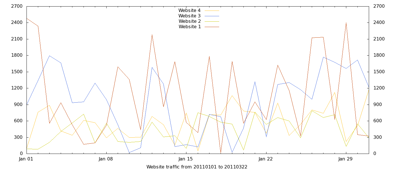
you’ll get the diagram on the left, that isn’t really informative: the lines continuously overlap, so it’s hard to see quickly which website had the highest traffic on each day. It’s even harder to see the total amount of traffic on each day. The solution is to stack the graphs, that is to use each line as the foundation on which to draw the others. In other words, instead of drawing four lines, one for each website, I wanted to draw:
- traffic for website 1 using the numbers in the second columns, as they are in the data file
- traffic for website 2 //summing its numbers in column 3 with the corresponding numbers in column 2
- traffic for website 3 //summing its numbers in column 4 with the corresponding numbers in column 2 and 3
- traffic for website 4 //summing its numbers in column 5 with the corresponding numbers in column 2, 3 and 4
It is possible to do this kind of stuff directly in Gnuplot, by calling utilities like sed or awk directly from within the Gnuplot command file as explained in this page. However, in my opinion it is much better and cleaner to do stuff like this before calling gnuplot, with an auxiliary script in Perl, Python or whatever strikes your fancy. The reason is that in this way you can pre-process the numbers in much more flexible, and self-documenting ways that Gnuplot is capable of: another way to say this is that it is better to keep number calculation and number plotting completely separate. For example, I also run an expanded version of the script below that calculates and stacks on the fly the moving averages over one month of the traffic to each website.
In this case, using a separate script to “stack” the data is also quick. All I had to do to rearrange the numbers as described above was to feed the data file to another script and save the result as another data file:
cat initial_data.dat | perl stack_data.pl > stacked_data.dat
Stack_data.pl is the simple Perl script below:
  #! /usr/bin/perl

  use strict;
  my $I;
    while (<>) {                            # read the data file from Standard Input
      chomp;
      my @FIELDS = split ' ', $_;           # put each column in a different
      my $DATE = shift @FIELDS;             # field of the @FIELDS array
      print "$DATE ";
      my $LINE_TOTAL = 0;
      for ($I = 0; $I <= $#FIELDS; $I++) {  # re-print the data, but making of
         $LINE_TOTAL += $FIELDS[$I];        # each column the sum of all the ones
         print " $LINE_TOTAL";              # preceeding it
      }
      print "n";                           # print the new numbers to Standard Output
   }
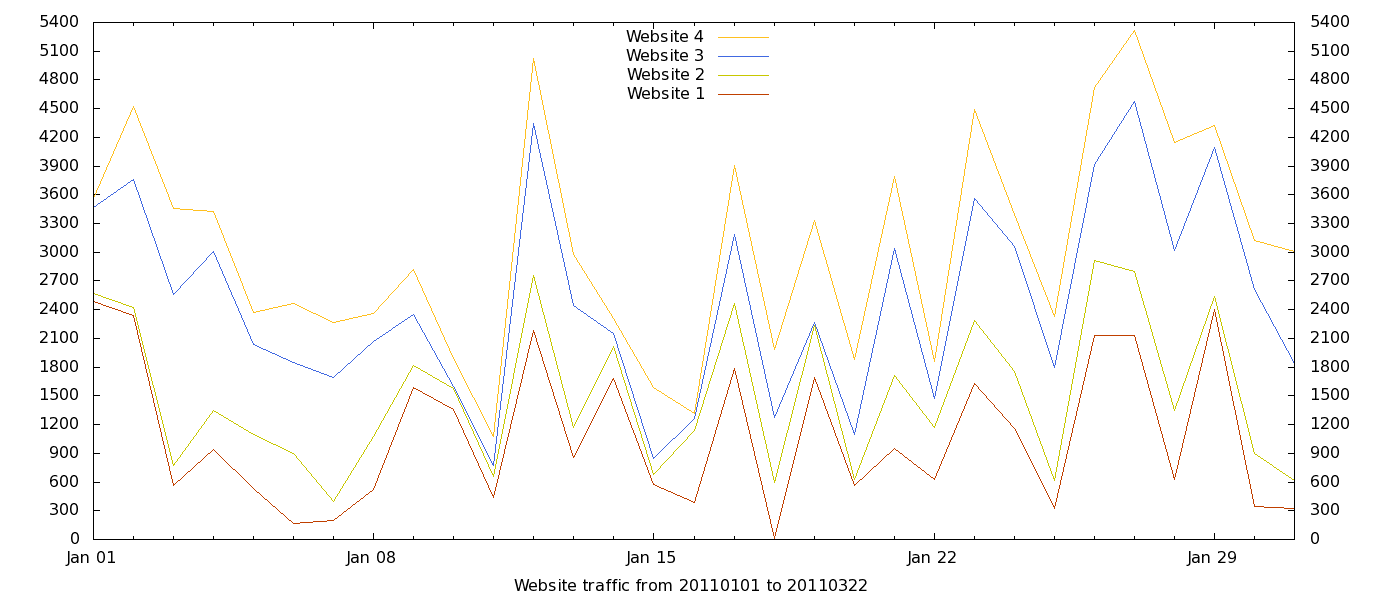
Here is what you get when plotting the stacked_data.dat file with the same style of the initial graph, that is with the same “plot” command. That is much better but, in my opinion, it wasn’t good enough yet. Personally, I think filled areas are more informative in cases like this. The way to obtain them is to use another style in the plot command. Replace the last line of the Gnuplot instruction file with this one (on ONE line!):
  plot ["20110101":"20110131"][:]
  'initial_data.dat' using 1:5 t "Website 4" w filledcurves x1 linestyle 4,
  'initial_data.dat' using 1:4 t "Website 3" w filledcurves x1 linestyle 3,
  'initial_data.dat' using 1:3 t "Website 2" w filledcurves x1 linestyle 2,
  'initial_data.dat' using 1:2 t "Website 1" w filledcurves x1 linestyle 1
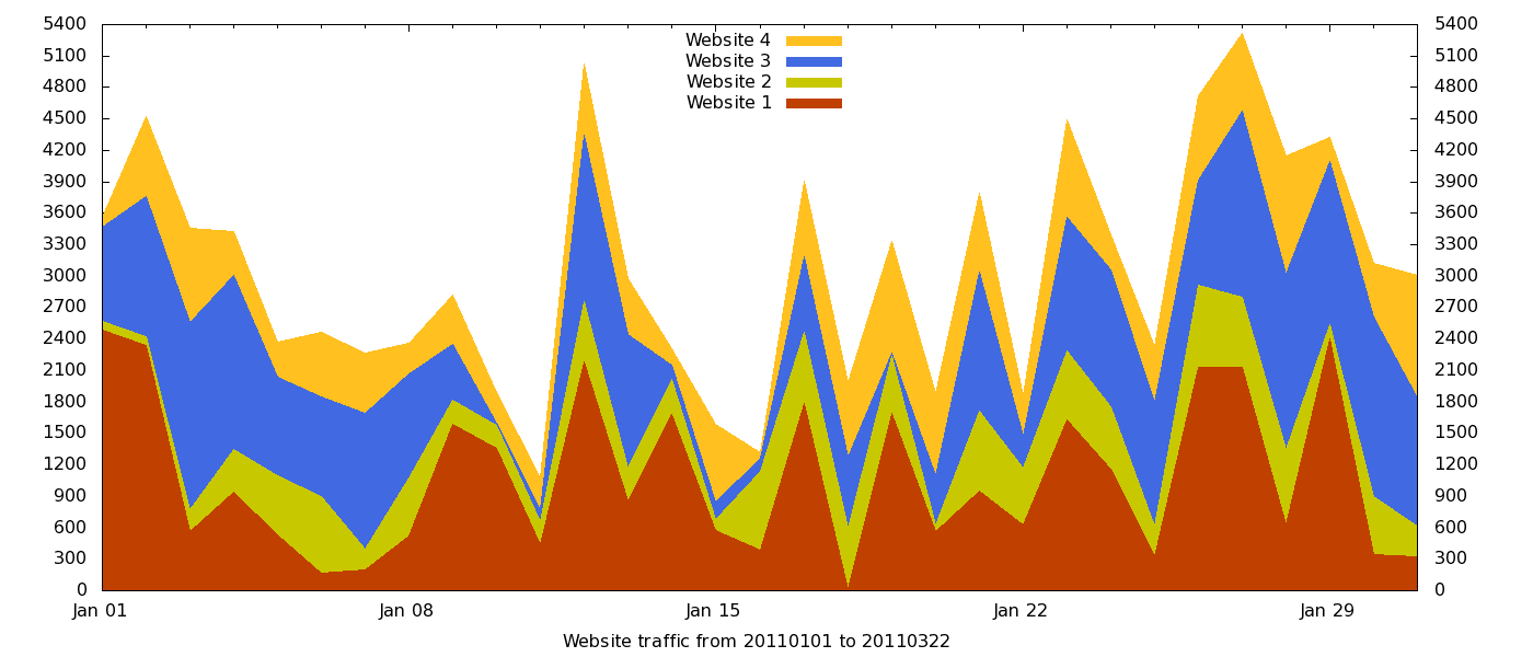
and this is what the plot will look like. Nicer, uh? Please note that the order in which each column is read and plotted in the command above is important. When Gnuplot draws a new line or area, it does it over what it has already drawn or paint. With lines (second diagram in this page) it makes no practical difference. With areas, instead, it’s esential to paint them in the right order. This means that you must plot first the highest area (“Website 4” in our example) that is the one that is the sum of all the original columns. Then comes the one that is the sum of only the first three columns etc…